
A tired kitchen drains energy. Color brings it back fast. Pick warm, grounded hues. Avoid harsh contrasts. Aim for a calm, clear plan that fits daily life.
In 2025, greens, deep blues, warm whites, and earthy neutrals lead the way. Two-tone layouts stay popular because they add depth without clutter. Focus on undertones, natural light, and one clear focal point to keep the design fresh and long-lasting.
This guide moves step by step. First trends, then pairings, then small or dark rooms, then coordination with counters and metals. Keep the choices simple and practical.
Which cabinet colors trend in 2025?
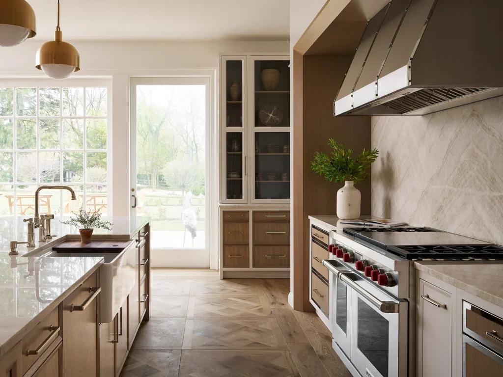
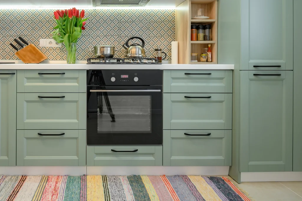
Kitchen color trends favor soft, nature-inspired hues. Greens and deep blues feel rich and calm. Warm whites replace stark whites. Earthy taupes and clays add comfort. Use stronger color on an island or on lower cabinets for balance.
3What makes these colors work
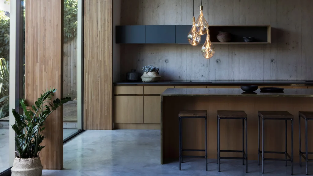
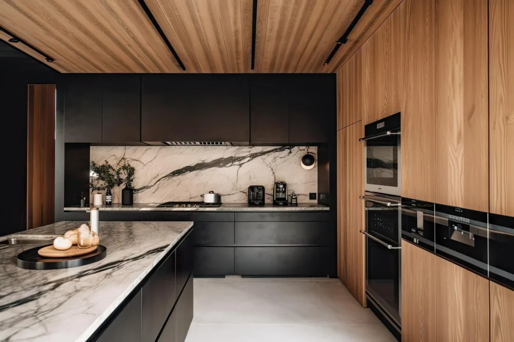
Greens feel organic and easy to live with. Deep blues read tailored and classic. Warm whites avoid the clinical look of cool white. Earth tones bring comfort. Charcoal gives drama when the room has good light. These families also play well with wood, stone, and mixed metals. Most kitchens look best when one color leads and the others support. That keeps the eye calm and the space readable.
How to test before you commit
Paint large sample boards. Move them around the room at morning, noon, and night. Hold chips next to floor, backsplash, and counter samples. Look for clashing undertones. If your stone is busy, keep cabinets quiet. If your stone is simple, you can use more color. Choose one focal area, like the island or range wall. Repeat that accent shade once or twice in stools, a runner, or small decor so the plan feels intentional. When in doubt, start with warm white uppers and a grounded lower color, then add wood for warmth.
Quick pairing table
| Color family | Best placement | Pairs with | Why it helps |
| Sage/olive | Full runs or island | Warm white, brass | Calming, natural |
| Deep navy | Island or lowers | Creamy quartz, nickel | Classic contrast |
| Warm white | Uppers or full | Oak, taupe walls | Soft and timeless |
| Clay/taupe | Lowers or full | Linen walls, brass | Cozy, modern |
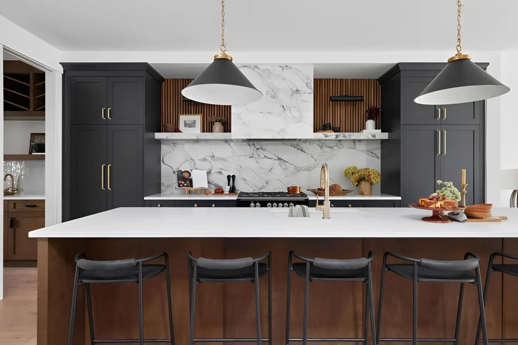
| Charcoal | Island or lowers | Light floors, glass | Dramatic anchor |
Are two-tone kitchen cabinets still a good idea?
Yes. Two-tone keeps the room grounded and open at the same time. Darker bases add stability; lighter uppers lift the sightline. It also lets you refresh later by repainting one zone.
Simple rules that rarely fail
Go darker on the bottom and lighter on top for balance. Keep undertones aligned: warm with warm, cool with cool. Repeat the darker tone at the toe kick for a built-in look. If ceilings are low, keep uppers light or use open shelving. Use hardware in one finish across all colors so the plan feels unified. Place the boldest shade on the island, not the perimeter, to avoid heavy corners.
Building a two-tone palette
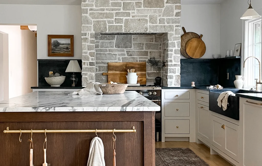
Start with your fixed surfaces: flooring, counters, and backsplash. Pick one light neutral for uppers that matches the counter undertone. Choose one deeper shade for lowers or the island that echoes a floor or vein color. Add a wood accent—stools, shelves, or hood trim—to warm the palette. Keep wall color soft and close to the upper tone. Limit yourself to three total hues: light, dark, and one wood. This keeps photos clean and maintenance simple while still giving the depth people love in 2025.
Mood pairings
| Uppers | Lowers | Island | Overall feel |
| Warm white | Forest green | Walnut | Organic, calm |
| Cream | Navy | Repeat cream | Classic, crisp |
| Greige | Charcoal | Veined stone | Modern, refined |
| Linen | Clay | Brick red accent | Earthy, collected |
Which upper and lower cabinet colors pair best?
Choose one contrast and one connector. The contrast is your light-to-dark shift. The connector is a shared undertone or material repeated through the room. This mix keeps the eye steady.
Reliable pairs
Warm white with olive. Cream with navy. Soft greige with charcoal. Beige with black. Soft white with clay. Each pair works because the warm or cool base stays consistent. Check the edge of each chip on white paper to spot hidden green, pink, or blue. If a chip shifts oddly near your floor or counter, drop it early.
How to match undertones the easy way
Lay all samples on the counter sample. If your counter veining is gray, lean cool. If your counter has gold or brown specks, lean warm. Take phone photos at different times of the day and compare. Good pairs look stable under both daylight and warm LEDs. If you must mix cool and warm, do it with small accents like textiles, not with cabinet paint.
Matrix for quick planning
| Uppers (light) | Lowers (deep) | Counter style | Metal finish |
| Warm white | Forest green | Creamy marble-look | Brushed brass |
| Cream | Navy | Honed soapstone-look | Polished nickel |
| Soft gray-beige | Charcoal | Subtle quartz vein | Matte black |
| Linen | Clay | Sand-beige quartz | Aged brass |
What color cabinets make small kitchens look bigger?
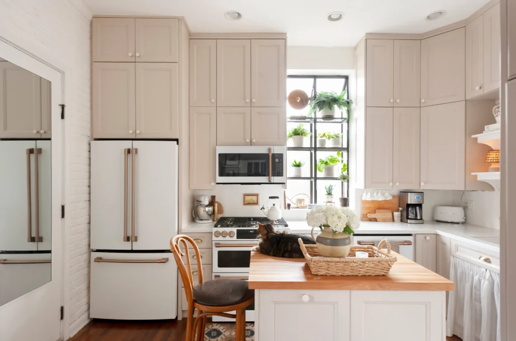
Light, warm neutrals help most. Off-whites, pale greige, and soft beige reflect light and reduce visual breaks. Keep contrasts low, and match uppers to walls so the room feels wider.
Small-space playbook
Use tone-on-tone for uppers and walls. This removes strong horizontal lines. Choose satin or semi-gloss to bounce light without glare. Keep door styles simple and avoid heavy crown where ceilings are low. Add under-cabinet lighting to lift shadows on worktops. Use a single backsplash tone close to cabinet color so grout lines do not chop the view. Choose light floors or large-format tiles to reduce joints. Limit hardware sizes and shapes so hardware does not become the “pattern.”
Can dark accents work?
Yes, in small doses. A charcoal rail, a slim frame edge, or one narrow pantry door can add depth without shrinking the space. If you love a dark island, keep it matte and pair it with high-LRV walls and counters. Repeat that dark only once more, such as on a light fixture or a chair leg. The rest stays soft and quiet. This balance lets a compact room feel intentional rather than cramped while still giving you the character you want.
Light-boosting moves
| Goal | Do this | Why it helps |
| Add height | Match wall and upper color | Removes horizon lines |
| Add width | Use light floors or wider planks | Fewer seams, wider read |
| Brighten tasks | Install LED strips under uppers | Clears shadows |
| Calm busy rooms | Keep backsplash close to cabinet tone | Less visual noise |
Do dark cabinets work in low-light kitchens?
They can work if you plan the light. Pair dark lowers with light walls and bright counters. Add layered lighting. Choose softer charcoals over pure black for depth without a harsh feel.
Make dark colors succeed
Raise the total lumens. Use a ceiling layer, task lights, and ambient accents. Keep uppers light or open to pull the gaze up. Pick satin or semi-gloss on dark paint to resist smudges and make cleaning easier. Add warm elements—wood stools, a wood hood, or woven textures—to stop the room from feeling cold. Choose a backsplash with some gloss to reflect micro-sparkle back into the space.
Checklist for dark kitchens
| Item | Dark-friendly choice | Purpose |
| Wall color | Warm white or pale greige | Adds brightness |
| Counter | Light quartz or marble-look | Bounces light |
| Backsplash | Glossy glazed or zellige-style | Texture and shine |
| Hardware | Aged brass or pewter | Warm contrast |
| Floor | Mid-tone wood | Grounded but not heavy |
Daily usability
Dark tones hide small scuffs better than light tones. They also frame light counters nicely in photos. The trade-off is dust and water spots on high-gloss black, so choose a slightly softer dark and wipe with microfiber. Good lighting turns this palette from “moody” to “welcoming.”
How do cabinet colors coordinate with countertops?
Start with the counter undertone. If veining is gray, lean cool cabinets. If flecks look gold or brown, lean warm cabinets. Use one strong pattern only once, and keep the other surface quiet.
A clear, repeatable process
Pick three cabinet chips that match the counter undertone. Check them in morning and evening light. Hold them next to flooring and drop the one that fights the floor. Pick hardware that matches your appliance metal or your faucet finish. If your counter is busy, select a quieter cabinet color so the eye rests. If your counter is simple, a richer cabinet shade can carry the character.
Quick coordination matrix
| Counter type | Undertone | Good cabinet families | Avoid |
| White marble-look (gray vein) | Cool | Soft white, light gray, navy | Yellowish creams |
| Quartz with warm veining | Warm | Cream, greige, olive | Blue-grays |
| Butcher block | Warm | Cream, clay, forest | Stark blue-white |
| Concrete-look | Cool-neutral | Charcoal, sage, warm white | Red-based beiges |
| Busy granite | Mixed | One quiet neutral | Extra patterns |
Extra tips
If you want a two-tone look, let the island repeat a color already found in the counter veins or floor knots. That tiny echo makes the contrast feel planned. Keep backsplash grout close to tile color to avoid a loud grid. Use edge profiles on counters that match the style of the doors: simple edge for slab doors, softer edge for shaker or bead detail.
Which cabinet colors match stainless steel appliances?
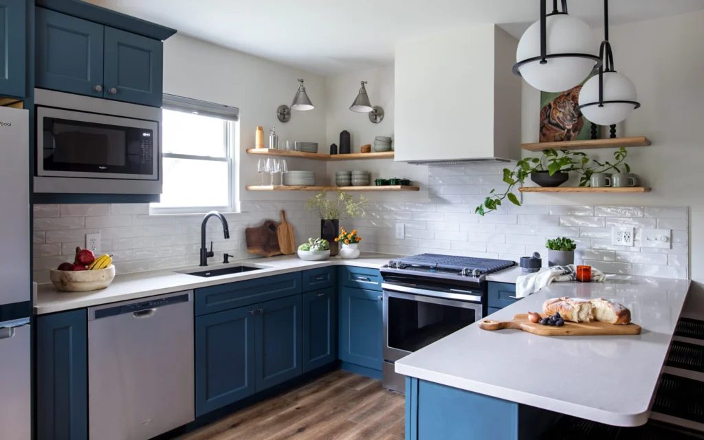
Stainless pairs best with warm whites, greige, taupe, earthy greens, deep navy, and charcoal. These hues balance the cool metal. Repeat the metal tone in hardware or lighting for a tied-together look.
Pairing ideas that rarely miss
Creamy white with stainless looks soft and clean. Greige with stainless reads calm and modern. Sage with stainless feels natural and fresh. Navy with stainless gives upscale contrast. Charcoal with stainless creates a sleek, urban tone. If you also have glass or mirror, keep upper cabinets lighter so the room does not feel cold.
Small matching table
| Cabinet color | Why it works with stainless |
| Warm white | Takes the chill off the metal |
| Greige/taupe | Adds warmth without yellow |
| Sage/olive | Nature tone complements steel |
| Navy | High contrast, still classic |
| Charcoal | Strong, modern balance |
Mixing metals
You can mix two metal finishes in one kitchen. A simple rule is one cool (stainless or chrome) plus one warm (brass or bronze). Repeat each finish at least twice so it feels intentional.
How do cabinet colors affect resale value?
Buyers tend to prefer light, warm neutrals because they can picture their own things. Pure white is less common now. A soft cream or greige reads current and friendly.
Choices that help listings
Use a warm, light main color across most cabinets. Add one accent on the island or range surround. Update hardware and lighting for crisp photos. Fresh paint with a smooth finish looks newer than it is. Keep counters and floors calm so cabinet color leads. If you plan to sell within a year, avoid loud colors on perimeter runs. Keep your bold moment small and easy to repaint. This approach protects broad buyer appeal while still giving a touch of personality that makes the space memorable during showings.
Risk vs. reward guide
| Choice | Buyer appeal | Notes |
| Warm white / greige | High | Broad taste fit |
| Soft green / blue | Medium-High | Works if muted |
| Charcoal / black | Medium | Needs strong light |
| Saturated brights | Low-Medium | Best as island only |
Conclusion
Choose a warm, grounded palette. Add contrast where it helps. Match undertones. Test in real light. Keep one clear focal point. Build a kitchen that feels good every day.
FAQ
Are white kitchen cabinets out in 2025?
No. White stays timeless when it is warm and layered. Add wood accents or a darker island to avoid a flat, sterile look.
What sheen is best for cabinet paint?
Semi-gloss is durable and easy to clean. Satin works when you want less shine. Avoid flat finishes on doors; they show marks and are harder to wipe.
How should I test cabinet colors at home?
Paint large boards, not tiny swatches. Move them through the room all day. Check next to floors, counters, and backsplash to confirm undertones.
Should the island be darker than the perimeter?
Often yes. A darker island anchors the room and hides wear. Keep the perimeter lighter for an open feel and better light bounce.
Do matte cabinets show fingerprints more?
Deep matte can show prints on darker colors. Use satin or a washable matte on dark shades, and keep handles where hands touch most.
Can I paint over stained wood cabinets?
Yes, with good prep. Clean, sand lightly, and use a quality bonding primer. Use thin, even coats of durable enamel for a smooth finish.
What wall color pairs with green cabinets?
Warm white, soft linen, or pale greige. Keep walls quieter than the cabinets. This lets green lead without making the room feel heavy.
How do I coordinate cabinet hardware with faucets and lights?
Choose one main metal and repeat it at least twice. You can mix one warm and one cool metal, but keep the mix intentional and consistent.