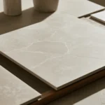
Too many choices cause clashing colors and costly rework.
Use a simple plan. Pick one hero surface, match undertones, set contrast, and test with light.
The fastest path looks like this: choose the hero surface first, map warm or cool undertones, decide on light or dark contrast, check fit with floor and backsplash, and test samples under day and night light. This removes guesswork.
You will see clear steps, not trends. We start with the big decision, then move to color logic, contrast, materials, detail control, island strategy, and final testing. Keep a note of your floor tone as you read.
Should You Choose Countertops or Cabinets First?
Cluttered decisions waste time. One pick must lead.
Choose the surface with the strongest pattern or the tightest limits. Then match the rest to it.
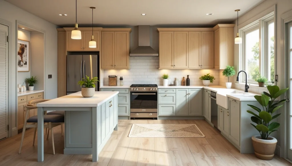
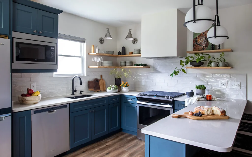
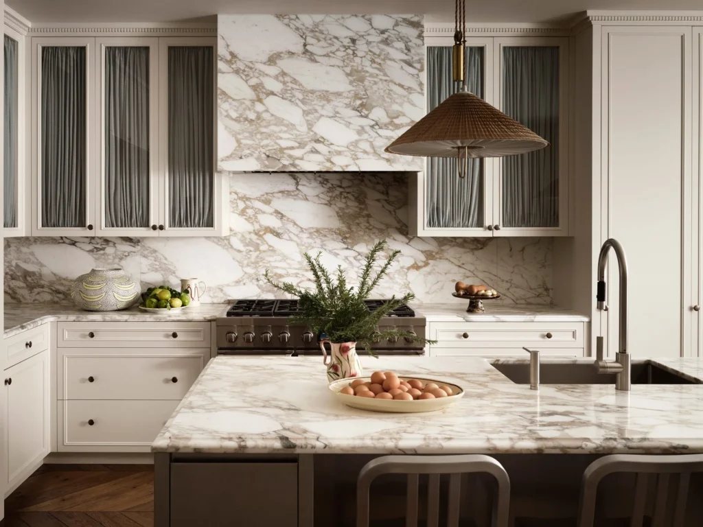
Start with the surface that is hardest to change or carries the boldest look. This is often the countertop. It sets color, pattern, and sheen. Then tune cabinet color, floor tone, and backsplash to support it.
Why one hero surface works
When one surface leads, your other choices become support acts. Countertops often have fixed slabs, limited lots, and visible movement. Cabinets offer wider paint control. Floors also cost a lot to change, so keep their tone in mind early. If your floor already exists, make it the second check after the hero choice.
Simple workflow
- Pick the hero surface (countertop or, if fixed, the floor).
- Name its undertone (warm, cool, or neutral).
- Decide cabinet contrast: lighter, darker, or tone-on-tone.
- Test with a backsplash that connects both.
- Confirm under daylight and evening light.
When cabinets should lead
Cabinets may lead if you must match a factory color or a custom wood species. In that case, hold small countertop samples against full door fronts and a floor piece. Stand back. If the door grain is lively, prefer a calmer counter.
Do Undertones Matter When Matching Colors?
Many rooms look “off” even when colors are close.
Undertones cause that. Get them right and the space feels calm.
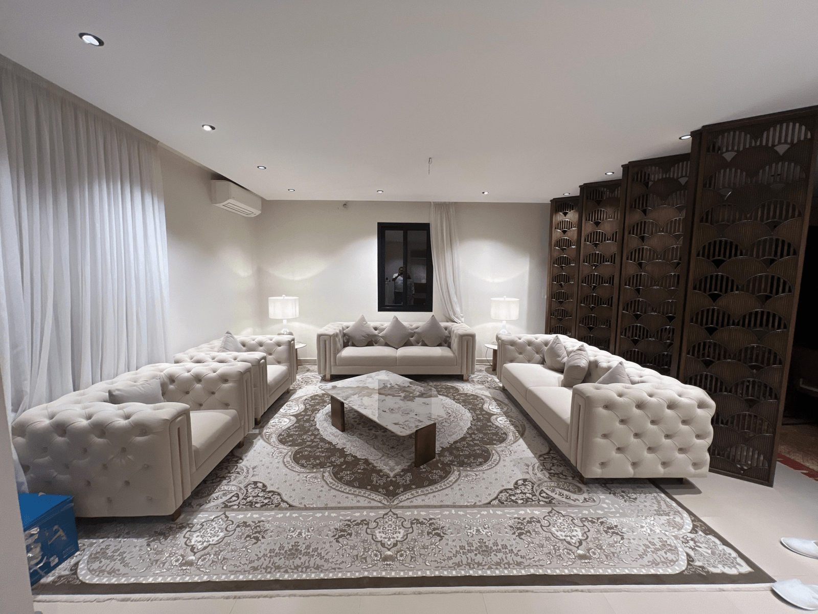
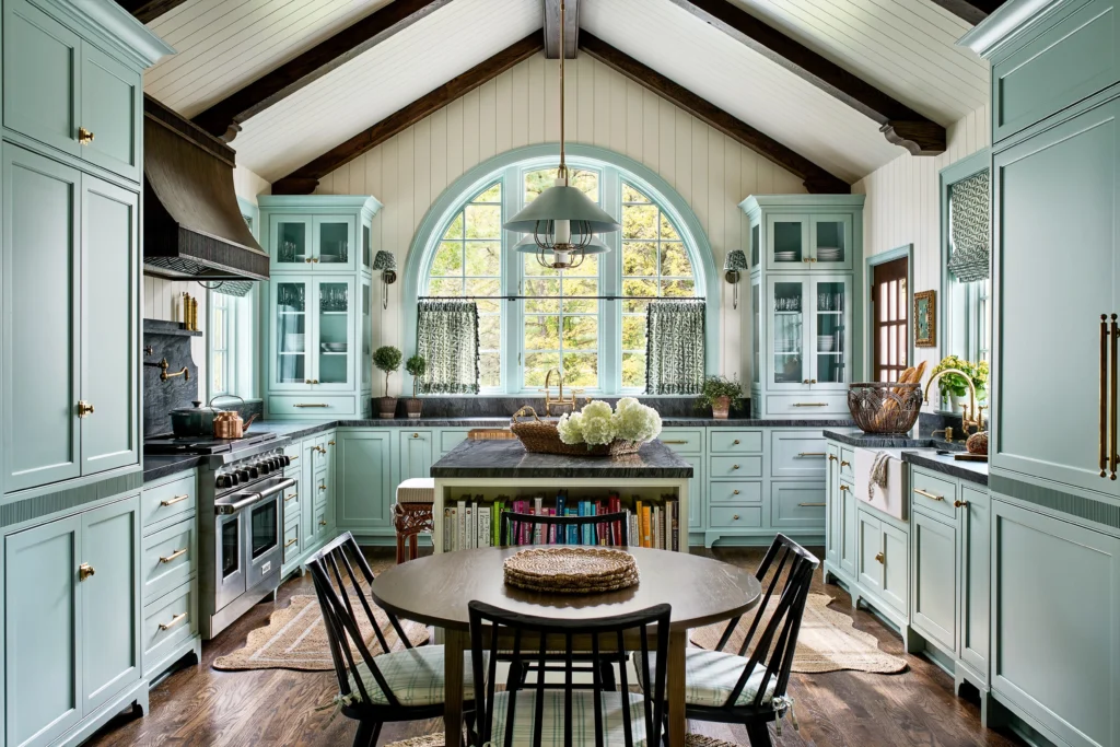
Yes. Undertones guide harmony. Warm counters like cream or beige pair well with warm cabinets and floors. Cool counters like gray or crisp white fit cool cabinet paints and cooler wood stains. Mixed undertones look unsettled.
Read undertones fast
- Warm: cream, taupe, golden beige, red or orange wood.
- Cool: blue-gray, charcoal, crisp white with blue cast, ash wood.
- Neutral: greige, soft stone, balanced wood stains.
Quick undertone map
| Cabinet undertone | Countertop tones that fit | Floor tones that support |
| Warm (honey, walnut) | Cream, warm white, caramel veining | Warm medium wood, tan stone |
| Cool (smoky gray, blue) | Cool white, light gray, charcoal | Cool gray wood, pale concrete |
| Neutral (greige) | Either warm or cool, avoid extremes | Mid-tone wood or stone, low contrast |
Tips
Use the largest samples you can borrow. Place them near your floor or a floor sample. Look at noon and at night. If you see a green or pink cast appear at night, note your bulbs. Warmer bulbs make cool counters look yellow. Cooler bulbs make warm cabinets look dull. Match your bulbs to your plan before you order.
Are Light Countertops Better With Dark Cabinets?
Dark-on-dark swallows light. Light-on-dark often feels crisp.
Still, the best choice depends on room size and light.
Often yes. Light counters with dark cabinets create easy contrast and bright work zones. But in sunny rooms or with light floors, dark counters can work. Check glare, shadows, and how your floor anchors the scheme.
【Dark cabinets with light countertop in bright daylight | Google Image: “dark cabinets light countertops kitchen contrast”】
What to check first
- Room light: North rooms need brightness. South rooms can handle depth.
- Floor tone: A light floor supports dark cabinets without making the room heavy.
- Maintenance: Light counters show coffee spills; dark counters show dust and water.
Practical pairings
| Cabinets | Countertops | Floors | Why it works |
| Dark espresso | Soft white, fine grain | Light oak | Bright work plane, grounded base |
| Deep navy | Veined white stone | Mid-tone oak | Classic contrast, not stark |
| Charcoal | Warm white, matte | Pale tile | Softens shadows, reduces glare |
Small kitchens
Keep counters light or mid. Use matte or honed to reduce glare. Let hardware and small decor add depth. If your floor is dark and fixed, lighten the counter and consider a mid cabinet color to bridge both.
When Is High Contrast More Effective?
Low contrast feels calm but can look flat.
High contrast adds energy but can look busy.
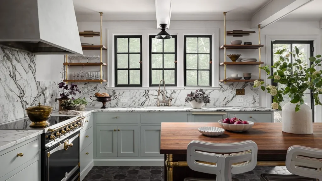
Use high contrast when you want clear edges and focal points. It works for simple cabinet lines and plain floors. Keep patterns quiet. Use low to medium contrast when cabinets or floors already show strong grain or movement.
Match contrast to pattern
If your countertop has bold veining, choose cabinets and floors with softer, more even tones. If your cabinets have heavy grain, choose a quieter countertop. Let one surface speak.
Contrast guide
| Scene | Countertop | Cabinets | Floor | Result |
| High contrast | Bright white | Inky black | Mid wood | Graphic, modern |
| Medium contrast | Light gray | Soft gray-green | Warm oak | Balanced, relaxed |
| Low contrast | Cream | Warm beige | Light oak | Calm, seamless |
Edges and sheen
High-contrast edges pop more in glossy finishes. If that feels harsh, choose satin or matte. Gloss on dark counters can show streaks. Matte on light counters cuts glare. Pick one glossy item only if you want a focal bounce, like a glazed backsplash.
Which Materials Balance Durability And Style Best?
Pretty surfaces fail if they cannot handle daily use.
Pick with both care and cleaning in mind.
There is no single winner. Choose by traffic, heat, stains, and your cleaning style. Stone, engineered stone, solid surface, wood, and laminate all work when paired with the right cabinet color, floor tone, and finish.
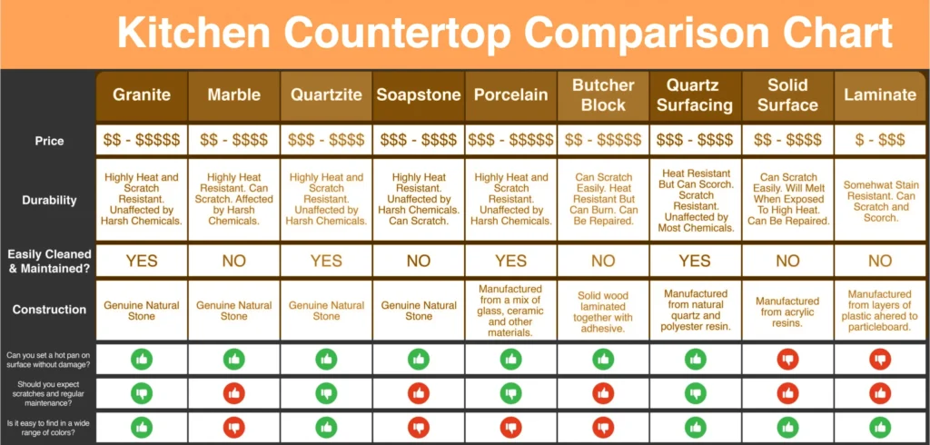
Quick comparison
| Material | Strengths | Watch outs | Pairs well with |
| Engineered stone | Stain resistant, even tone | Heat pads needed | Most cabinet paints; floors from light to mid |
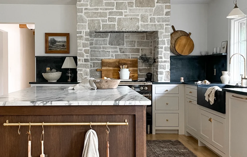
| Natural stone | Unique veining, high heat tolerance | Sealing, etching risk by acids | Simple cabinets, quiet floors |
| Solid surface | Seamless look, repairable | Heat sensitive | Minimal cabinets, matte floors |
| Wood | Warm feel, soft touch | Needs oil or finish care | Cool cabinets, stone-look floors |
| Laminate | Budget, many looks | Edge wear over time | Painted cabinets, pattern-light floors |
Style plus function
If your floor is a busy wood grain, pick a calm countertop like a fine-grain quartz. If your cabinets are flat and plain, a veined stone adds life. Keep sink and cooktop zones in mind. Choose rounded edges if you want a softer look and less chipping, or square edges for a crisp line with modern cabinets.
Can Busy Countertops Pair With Detailed Cabinets?
Two bold surfaces often fight for attention.
You can make them work, but plan the rhythm.
Yes, if you control scale, spacing, and sheen. Let one pattern lead and the other sit back. Keep the floor simple. Use a quiet backsplash that links both without adding another rhythm.
Control the pattern mix
- Scale: Big veins pair better with simple door styles.
- Density: Heavy speckle needs flat cabinet fronts.
- Direction: Vein direction should not fight wood grain.
Keep a neutral anchor
Use the floor as the calm plane. Choose a mid-tone wood or stone with even color. This gives the eye a rest and ties the scene together.
Sheen and hardware
Reduce noise with matte paint on detailed doors. Keep hardware simple. Choose one metal tone for unity. If you must mix metals, repeat each finish at least twice so it feels planned, not random.
Should Your Island Match or Contrast?
One big mass in the middle draws the eye.
A change here can fix balance fast.
It depends on your goals. Match for a seamless look. Contrast for a focal point or to break up large rooms. Keep ties in undertone and repeat the island color at least once elsewhere.
When to match
Small spaces and strong floors do best with matching islands. The room reads calm and larger. If your countertop has dramatic veining, matching helps avoid visual overload.
When to contrast
Large rooms, simple floors, and plain door styles can take a dark island under light counters, or a light island under dark counters. Use the same countertop edge, or echo the island color in stools, open shelf accents, or a small wall to keep unity.
Island top choices
Some choose a different countertop on the island. If you do, change only one variable at a time: color or pattern or material, not all three. Keep undertones aligned with the perimeter counters and the floor.
How Do You Test Samples At Home?
Showroom lights can fool the eye.
Your room light and floor color tell the truth.
Test large samples on-site for at least two days. Place them on or near the floor, under the same bulbs you will use. Check morning, noon, and night. Keep notes about shadows, glare, and cleaning marks.
Simple test plan
- Put the cabinet door, countertop piece, and a floor sample together.
- Use painter’s tape to hold them upright.
- Move them around the room.
- Photograph at different times.
What to watch
| Time | What to notice | Fix if needed |
| Morning | Cool light shifts whites blue | Pick warmer white or change bulbs |
| Noon | True color, most neutral | Confirm final choices here |
| Evening | Warm bulbs shift grays green or brown | Adjust bulb temp to 3000–3500K |
Cleanability check
Rub a bit of coffee or flour on the sample and wipe it. See what shows. Dark counters show dust. Light counters show stains. Matte shows hand marks less than glossy. Choose based on what you can keep clean, not only on looks.
Conclusion
Pick one hero surface. Match undertones. Set contrast with care. Test at home with your floor and lights. Keep patterns calm and let one surface lead.
FAQ
What color countertop goes with white cabinets?
Soft white with mild veining keeps a clean look. Light gray or warm greige adds depth. Avoid stark contrast if the floor is very dark, or it may feel choppy.
Should kitchen island be a different color?
Yes, if you want a focal point or to break up a large room. Keep undertones aligned. Repeat the island color in stools or accents for balance and unity.
Should backsplash match countertop or cabinets?
Match the undertone of the countertop first, then echo cabinet color in grout or small accents. If both are bold, choose a quiet tile to avoid visual noise.
Do floors need to match cabinets or countertops?
They do not need to match. Use floors as an anchor with mid tones. Keep undertones aligned. Avoid three strong patterns at once to reduce clutter.
What countertop looks best with wood cabinets?
Calm, light counters with subtle movement usually work well. Cool woods like ash take cool whites. Warm woods like oak take cream or warm white with soft veining.
Are two tone cabinets still in style?
Yes. Use darker bases and lighter uppers for visual lift. Keep undertones consistent. Tie both parts together with a countertop that bridges the two shades.
How many colors should a kitchen have?
Three is a safe plan: one main, one support, one accent. Floors count as one. Keep contrast clear. Repeat each color at least twice for cohesion.
Should I choose quartz or granite for busy kitchens?
Quartz resists stains and is easy to keep even. Granite handles heat well and has unique movement. Decide by care habits and how the pattern pairs with your cabinets and floor.